Plotting with Matplotlib#
A straigh forward and simple library for plotting data is matplotlib.
See also:
import math
import matplotlib.pyplot as plt
For plotting, we need values to plot. Let’s start with a list of x-values:
x_values = range(0, 360, 10)
To compute the corresponding y-values, we use a for loop, that creates a new list of values equal to the x_values list and computes a new number for each entry:
y_values = [math.sin(x * math.pi / 180) for x in x_values]
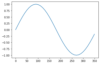
Then, let’s draw a simple plot
plt.plot(x_values, y_values)
[<matplotlib.lines.Line2D at 0x12aa15610>]
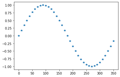
Plots can be modified in various ways.
plt.plot(x_values, y_values, '*')
[<matplotlib.lines.Line2D at 0x12ab6c3d0>]
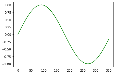
plt.plot(x_values, y_values, color='green')
[<matplotlib.lines.Line2D at 0x12abddc10>]
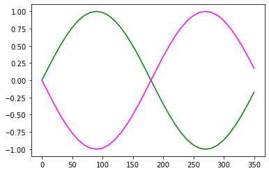
If you want to combine multiple plots in one figure, you can do this:
plt.plot(x_values, y_values, color='green')

neg_y_values = [- y for y in y_values]
plt.plot(x_values, neg_y_values, color='magenta')
[<matplotlib.lines.Line2D at 0x12ac5d130>]
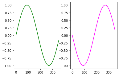
Sub-plots#
The subplots command allows you to have multiple plots in one block.
fig,axs = plt.subplots(1, 2)

axs[0].plot(x_values, y_values, color='green')
axs[1].plot(x_values, neg_y_values, color='magenta')
[<matplotlib.lines.Line2D at 0x12acffc10>]
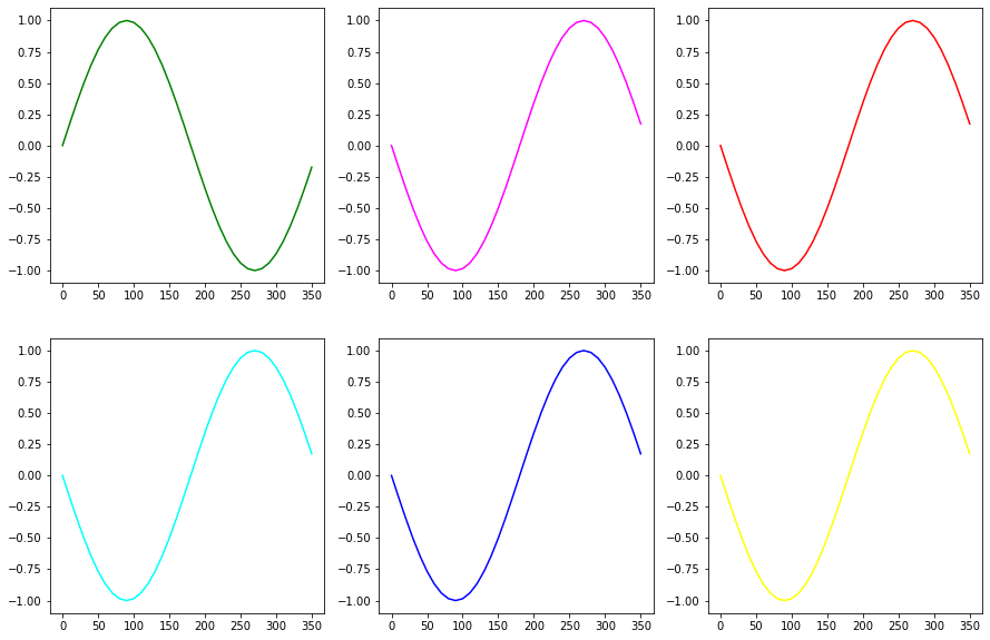
fig,axs = plt.subplots(2, 3, figsize=[15,10])

axs[0,0].plot(x_values, y_values, color='green')
axs[0,1].plot(x_values, neg_y_values, color='magenta')
axs[0,2].plot(x_values, neg_y_values, color='red')
axs[1,0].plot(x_values, neg_y_values, color='cyan')
axs[1,1].plot(x_values, neg_y_values, color='blue')
axs[1,2].plot(x_values, neg_y_values, color='yellow')
[<matplotlib.lines.Line2D at 0x12aec7190>]
Exercise#
Plot sinus and cosinus of values between 0 and 360 degrees in one plot.