Trailer: Bio-image Analysis with Python#
In the following chapters we will dive into image analysis, machine learning and bio-statistics using Python. This first notebook serves as a trailer of what we will be doing.
Python notebooks typically start with the imports of Python libraries which the notebook will use. The reader can check first if all those libraries are installed before going through the whole notebook.
import numpy as np
from skimage.io import imread, imshow
import pyclesperanto_prototype as cle
from skimage import measure
import pandas as pd
import seaborn
import apoc
import stackview
Working with image data#
We start with loading the image data of interest. In this example we load an image showing a zebrafish eye, courtesy of Mauricio Rocha Martins, Norden lab, MPI CBG Dresden.
# open an image file
multichannel_image = imread("../../data/zfish_eye.tif")

# extract a channel
single_channel_image = multichannel_image[:,:,0]

cropped_image = single_channel_image[200:600, 500:900]

stackview.insight(cropped_image)

|

|
Image filtering#
A common step when working with fluorescence microscopy images is subtracting background intensity, e.g. resulting from out-of-focus light. This can improve image segmentation results further down in the workflow.
# subtract background using a top-hat filter
background_subtracted_image = cle.top_hat_box(cropped_image, radius_x=20, radius_y=20)

stackview.insight(background_subtracted_image)

|

|
Image segmentation#
For segmenting the nuclei in the given image, a huge number of algorithms exist. Here we use a classical approach named Voronoi-Otsu-Labeling, which is certainly not perfect.
label_image = np.asarray(cle.voronoi_otsu_labeling(background_subtracted_image, spot_sigma=4))

# show result
stackview.insight(label_image)

|
|
Measurements and feature extraction#
After the image is segmented, we can measure properties of the individual objects. Those properties are typically descriptive statistical parameters, called features. When we derive measurements such as the area or the mean intensity, we extract those two features.
statistics = measure.regionprops_table(label_image,
                                       intensity_image=cropped_image,
                                       properties=('area', 'mean_intensity', 'major_axis_length', 'minor_axis_length'))
Working with tables#
The statistics object created above contains a Python data structure, a dictionary of measurement vectors, which is not most intuitive to look at. Hence, we convert it into a table. Data scientists often call these tables DataFrames, which are available in the pandas library.
dataframe = pd.DataFrame(statistics)
We can use existing table columns to compute other measurements, such as the aspect_ratio.
dataframe['aspect_ratio'] = dataframe['major_axis_length'] / dataframe['minor_axis_length']
dataframe
| area | mean_intensity | major_axis_length | minor_axis_length | aspect_ratio | |
|---|---|---|---|---|---|
| 0 | 294.0 | 36604.625850 | 25.656180 | 18.800641 | 1.364644 |
| 1 | 91.0 | 37379.769231 | 20.821990 | 6.053507 | 3.439658 |
| 2 | 246.0 | 44895.308943 | 21.830827 | 14.916032 | 1.463581 |
| 3 | 574.0 | 44394.637631 | 37.788705 | 19.624761 | 1.925563 |
| 4 | 518.0 | 45408.903475 | 26.917447 | 24.872908 | 1.082199 |
| ... | ... | ... | ... | ... | ... |
| 108 | 568.0 | 48606.121479 | 37.357606 | 19.808121 | 1.885974 |
| 109 | 175.0 | 25552.074286 | 17.419031 | 13.675910 | 1.273702 |
| 110 | 460.0 | 39031.419565 | 26.138592 | 23.522578 | 1.111213 |
| 111 | 407.0 | 39343.292383 | 28.544027 | 19.563792 | 1.459023 |
| 112 | 31.0 | 29131.322581 | 6.892028 | 5.711085 | 1.206781 |
113 rows × 5 columns
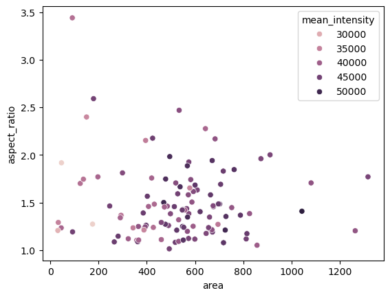
Plotting#
Measurements can be visualized using plots.
seaborn.scatterplot(dataframe, x='area', y='aspect_ratio', hue='mean_intensity')
<Axes: xlabel='area', ylabel='aspect_ratio'>
Descriptive statistics#
Taking this table as a starting point, we can use statistics to get an overview about the measured data.
mean_area = np.mean(dataframe['area'])
stddev_area = np.std(dataframe['area'])

print("Mean nucleus area is", mean_area, "+-", stddev_area, "pixels")
Mean nucleus area is 524.4247787610619 +- 231.74703195433014 pixels
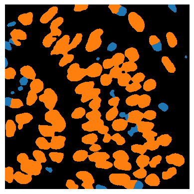
Classification#
For better understanding the internal structure of tissues, but also to correct for artifacts in image processing workflows, we can classify cells, for example according to their size and shape.
object_classifier = apoc.ObjectClassifier('../../data/blobs_classifier.cl')
classification_image = object_classifier.predict(label_image, cropped_image)

stackview.imshow(classification_image)