Method comparison#
Assume for a specific type of measurement, there are two methods for performing it. A common question in this context is if both methods could replace each other. Therefore, similarity of measurements is investigated. One method for this is Bland-Altman analysis called after Martin Bland and Douglas Altman.
See also Altman and Bland: Measurement in Medicine: the Analysis of Method Comparison Studies
import numpy as np
import matplotlib.pyplot as plt
import pandas as pd
Before we dive into Bland-Altman analysis, we have a look at straight-forward methods for comparing methods. An important assumption is that we worked with paired data. That means we can apply the two measurement methods to the same sample without destroying it and without the two methods harming each other.
# make up some data
measurement_A = [1, 9, 7, 1, 2, 8, 9, 2, 1, 7, 8]
measurement_B = [4, 5, 5, 7, 4, 5, 4, 6, 6, 5, 4]

# show measurements as table
pd.DataFrame([measurement_A, measurement_B], ["A", "B"]).transpose()
| A | B | |
|---|---|---|
| 0 | 1 | 4 |
| 1 | 9 | 5 |
| 2 | 7 | 5 |
| 3 | 1 | 7 |
| 4 | 2 | 4 |
| 5 | 8 | 5 |
| 6 | 9 | 4 |
| 7 | 2 | 6 |
| 8 | 1 | 6 |
| 9 | 7 | 5 |
| 10 | 8 | 4 |
Comparison of means#
A very simple method for comparing arrays of measurements is comparing their means.
print("Mean(A) = " + str(np.mean(measurement_A)))
print("Mean(B) = " + str(np.mean(measurement_B)))
Mean(A) = 5.0
Mean(B) = 5.0
Using this method one could conclude that both methods deliver similar measurements because their mean is equal. However, this might be misleading.
Scatter plots#
A more visual method for method comparison is drawing scatter plots. In these plots measurements of the one method are plotted against the other method.
plt.plot(measurement_A, measurement_B, "*")
plt.plot([0, 10], [0, 10])
plt.axis([0, 10, 0, 10])
plt.xlabel('measurement A')
plt.ylabel('measurement B')
plt.show()
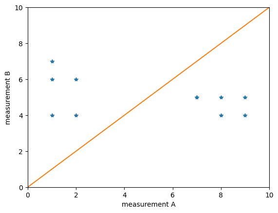
Obviously A and B lead to quite different results. If the blue points would lie on the orange line, we would conclude that the measurements are related.
Histograms#
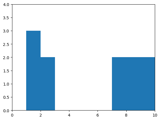
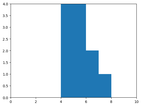
As we concluded already that both measurements lie in different ranges, we should take a look at the distribution. Histograms are a good plot of choice. To make sure histograms for both measurements are visualized the same, e.g. with the same range on the x-axis, we can write our own little draw_histogram function:
def draw_histogram(data):
    counts, bins = np.histogram(data, bins=10, range=(0,10))
    plt.hist(bins[:-1], bins, weights=counts)
    plt.axis([0, 10, 0, 4])
    plt.show()

draw_histogram(measurement_A)
draw_histogram(measurement_B)
Correlation#
For measuring the relationship between two measurements, we can take Pearson’s definition of a correlation coefficient
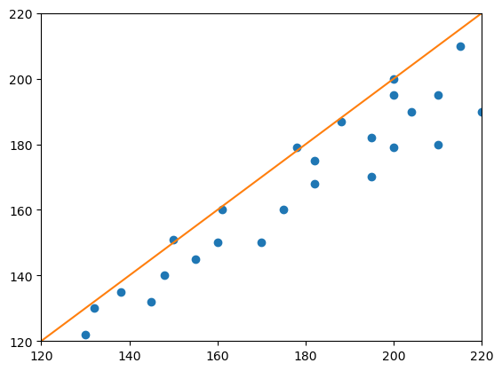
The data for the following expriment is taken from Altman & Bland, The Statistician 32, 1983, Fig. 1.
# new measurements
measurement_1 = [130, 132, 138, 145, 148, 150, 155, 160, 161, 170, 175, 178, 182, 182, 188, 195, 195, 200, 200, 204, 210, 210, 215, 220, 200]
measurement_2 = [122, 130, 135, 132, 140, 151, 145, 150, 160, 150, 160, 179, 168, 175, 187, 170, 182, 179, 195, 190, 180, 195, 210, 190, 200]

# scatter plot
plt.plot(measurement_1, measurement_2, "o")
plt.plot([120, 220], [120, 220])
plt.axis([120, 220, 120, 220])
plt.show()
# Determining Pearson's correlation coefficient r with a for-loop
import numpy as np

# get the mean of the measurements
mean_1 = np.mean(measurement_1)
mean_2 = np.mean(measurement_2)

# get the number of measurements
n = len(measurement_1)

# get the standard deviation of the measurements
std_dev_1 = np.std(measurement_1)
std_dev_2 = np.std(measurement_2)

# sum the expectation of
sum = 0
for m_1, m_2 in zip(measurement_1, measurement_2):
    sum = sum + (m_1 - mean_1) * (m_2 - mean_2) / n

r = sum / (std_dev_1 * std_dev_2)

print ("r = " + str(r))
r = 0.9435300113035253
# Determine Pearson's r using scipy
from scipy import stats

stats.pearsonr(measurement_1, measurement_2)[0]
0.9435300113035257
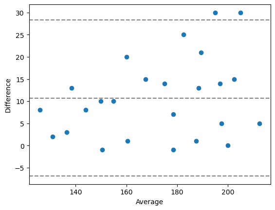
Bland-Altman plots#
Bland-Altman plots are a way to visualize differences between paired measurements specifically. When googling for python code that draws such plots, one can end up with this solution:
# A function for drawing Bland-Altman plots
# source https://stackoverflow.com/questions/16399279/bland-altman-plot-in-python
import matplotlib.pyplot as plt
import numpy as np

def bland_altman_plot(data1, data2, *args, **kwargs):
    data1     = np.asarray(data1)
    data2     = np.asarray(data2)
    mean      = np.mean([data1, data2], axis=0)
    diff      = data1 - data2                   # Difference between data1 and data2
    md        = np.mean(diff)                   # Mean of the difference
    sd        = np.std(diff, axis=0)            # Standard deviation of the difference

    plt.scatter(mean, diff, *args, **kwargs)
    plt.axhline(md,           color='gray', linestyle='--')
    plt.axhline(md + 1.96*sd, color='gray', linestyle='--')
    plt.axhline(md - 1.96*sd, color='gray', linestyle='--')
    plt.xlabel("Average")
    plt.ylabel("Difference")
# draw a Bland-Altman plot
bland_altman_plot(measurement_1, measurement_2)
plt.show()
Exercise#
Process the banana dataset again, e.g. using a for-loop that goes through the folder ../data/banana/, and processes all the images. Measure the size of the banana slices using the scikit-image thresholding methods threshold_otsu and threshold_yen. Compare both methods using the techniques you learned above.