Brightness and Contrast#
When visualizing images in Jupyter notebooks it is important to show them in a way that a reader can see what we’re writing about. Therefore, adjusting brightness and contrast is important. We can do this by modifying the display range, the range of displayed grey values.
For demonstration purposes we use the cells3d example image of scikit-image.
import numpy as np
from skimage.data import cells3d
from skimage.io import imread
import stackview
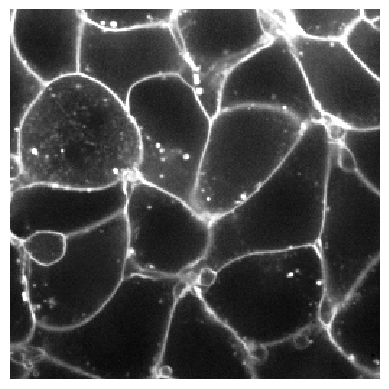
The cells3d dataset is a 4D-image. Using array-acces we extract a single 2D slice and show it.
image = cells3d()[30,0]
image.shape
(256, 256)
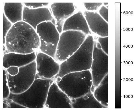
stackview.insight(image)

|

|
Notice that here the colorbar ranges from 0 to about 45000. Minimum and maxium intensity are also given on the right.
You can also tune minimum and maximum display intensity manually like this:
stackview.display_range(image)
For specifying a fixed maximum intensity for display, you can use the imshow function:
stackview.imshow(image, max_display_intensity=10000)
Adjusting visualization independent from the specific image#
The next image we open may, or may not, have a similar grey-value range. It makes sense to analyse the intensity distribution of the image. Percentiles are the way to go. E.g. the 95th percentile specifies the intensity threshold under which 95% of the image are. One could use this as an upper limit for display. This would also work for other images, where the intensity distribution is different.
upper_limit = np.percentile(image, 95)
upper_limit
6580.0
We can use this value to configure the display. Note the colorbar has a maximum of this value now. Hence, the pixels with intensity above this value may be shown wrongly.
stackview.imshow(image, max_display_intensity=upper_limit, colorbar=True)
Exercise#
The M51 dataset (taken from ImageJ’s example images) is also an image that is hard to display correctly. After loading it, it is displayed like this:
m51 = imread("../../data/m51.tif")

stackview.insight(m51)

|

|
Study the intensity distribution of the image and show it up to its 99th percentile.