Multivariate views#
In this notebook, we show a few examples of how to have plots with graphs of different types in a figure, like having a scatter plot with marginal distributions or even a multivariate plot with pair relationships of all properties in a table.
Because these plots involve managing subplots, they are all figure-level functions.
import pandas as pd
import numpy as np
import matplotlib.pyplot as plt
import seaborn as sns
We start by loading a table of measurments into a pandas DataFrame.
df = pd.read_csv("../../data/BBBC007_analysis.csv")
df
| area | intensity_mean | major_axis_length | minor_axis_length | aspect_ratio | file_name | |
|---|---|---|---|---|---|---|
| 0 | 139 | 96.546763 | 17.504104 | 10.292770 | 1.700621 | 20P1_POS0010_D_1UL |
| 1 | 360 | 86.613889 | 35.746808 | 14.983124 | 2.385805 | 20P1_POS0010_D_1UL |
| 2 | 43 | 91.488372 | 12.967884 | 4.351573 | 2.980045 | 20P1_POS0010_D_1UL |
| 3 | 140 | 73.742857 | 18.940508 | 10.314404 | 1.836316 | 20P1_POS0010_D_1UL |
| 4 | 144 | 89.375000 | 13.639308 | 13.458532 | 1.013432 | 20P1_POS0010_D_1UL |
| ... | ... | ... | ... | ... | ... | ... |
| 106 | 305 | 88.252459 | 20.226532 | 19.244210 | 1.051045 | 20P1_POS0007_D_1UL |
| 107 | 593 | 89.905565 | 36.508370 | 21.365394 | 1.708762 | 20P1_POS0007_D_1UL |
| 108 | 289 | 106.851211 | 20.427809 | 18.221452 | 1.121086 | 20P1_POS0007_D_1UL |
| 109 | 277 | 100.664260 | 20.307965 | 17.432920 | 1.164920 | 20P1_POS0007_D_1UL |
| 110 | 46 | 70.869565 | 11.648895 | 5.298003 | 2.198733 | 20P1_POS0007_D_1UL |
111 rows × 6 columns
Plotting joint and marginal distributions#
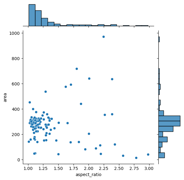
To have a joint distribution of two variables with the marginal distributions on the sides, we can use jointplot.
sns.jointplot(data=df, x="aspect_ratio", y="area")
<seaborn.axisgrid.JointGrid at 0x250479ad070>
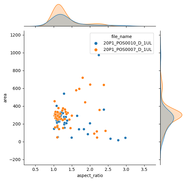
It is possible to separate groups by passing a categorical property to the hue argument. This has an effect on the marginal distribution, turning them from histogram to kde plots.
sns.jointplot(data=df, x="aspect_ratio", y="area", hue = 'file_name')
<seaborn.axisgrid.JointGrid at 0x250479c9d90>
Plotting many distributions at once#
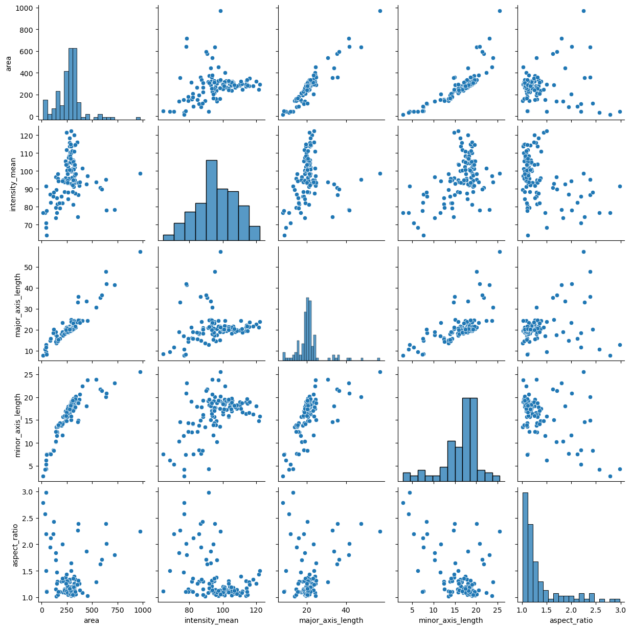
The above examples displayed a plot with relationship between two properties. This can be further expanded with the pairplot function
sns.pairplot(data=df)
<seaborn.axisgrid.PairGrid at 0x2504805e730>
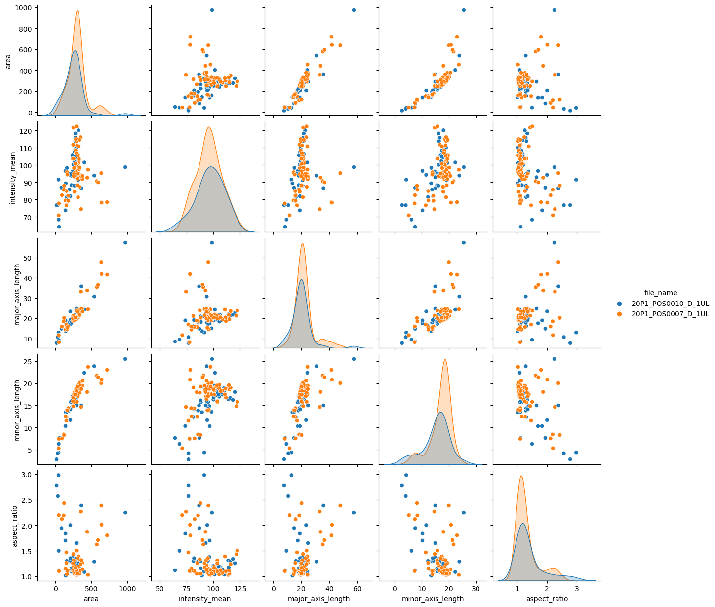
sns.pairplot(data=df, hue="file_name")
<seaborn.axisgrid.PairGrid at 0x2504a5fba60>
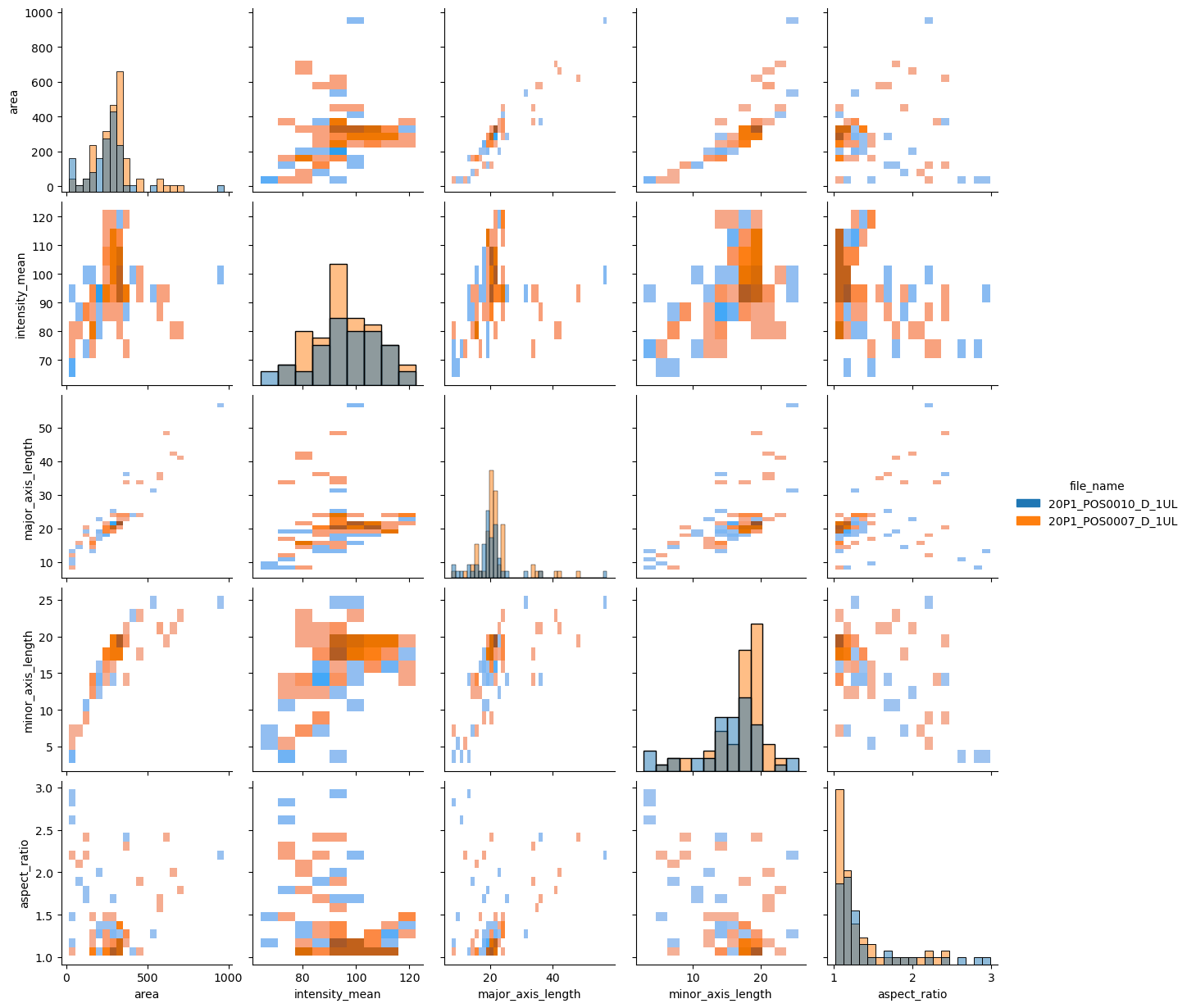
If you have too many points, displaying every single point may yield graphs too poluted. An alternative visualization in this case could be a 2D histogram plot. We can do that by changing the kind argument to “hist”.
sns.pairplot(data=df, hue="file_name", kind = "hist")
<seaborn.axisgrid.PairGrid at 0x2504a613e50>
Exercise#
You may have noticed that the pairplot is redundant in some plots because the upper diagonal displays the same relationships rotated.
Redraw the pairplot to display only the lower diagonal of the plots.
Hint: explore the properties of the pairplot