Introduction to Seaborn#
Seaborn is a library for making statistical graphics in Python. It builds on top of matplotlib and integrates closely with pandas data structures.
import seaborn as sns

import numpy as np
import matplotlib.pyplot as plt
import pandas as pd
Scatter plots with seaborn#
We start by loading a table of measurements into a dataframe df.
df = pd.read_csv("../../data/BBBC007_analysis.csv")
df
| area | intensity_mean | major_axis_length | minor_axis_length | aspect_ratio | file_name | |
|---|---|---|---|---|---|---|
| 0 | 139 | 96.546763 | 17.504104 | 10.292770 | 1.700621 | 20P1_POS0010_D_1UL |
| 1 | 360 | 86.613889 | 35.746808 | 14.983124 | 2.385805 | 20P1_POS0010_D_1UL |
| 2 | 43 | 91.488372 | 12.967884 | 4.351573 | 2.980045 | 20P1_POS0010_D_1UL |
| 3 | 140 | 73.742857 | 18.940508 | 10.314404 | 1.836316 | 20P1_POS0010_D_1UL |
| 4 | 144 | 89.375000 | 13.639308 | 13.458532 | 1.013432 | 20P1_POS0010_D_1UL |
| ... | ... | ... | ... | ... | ... | ... |
| 106 | 305 | 88.252459 | 20.226532 | 19.244210 | 1.051045 | 20P1_POS0007_D_1UL |
| 107 | 593 | 89.905565 | 36.508370 | 21.365394 | 1.708762 | 20P1_POS0007_D_1UL |
| 108 | 289 | 106.851211 | 20.427809 | 18.221452 | 1.121086 | 20P1_POS0007_D_1UL |
| 109 | 277 | 100.664260 | 20.307965 | 17.432920 | 1.164920 | 20P1_POS0007_D_1UL |
| 110 | 46 | 70.869565 | 11.648895 | 5.298003 | 2.198733 | 20P1_POS0007_D_1UL |
111 rows × 6 columns
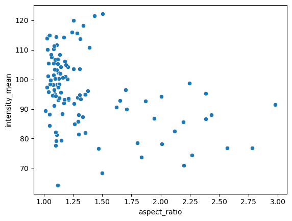
From this table we can make a scatter plot of aspect ratio versus mean intensity.
sns.scatterplot(data=df, x="aspect_ratio", y="intensity_mean")
<AxesSubplot: xlabel='aspect_ratio', ylabel='intensity_mean'>
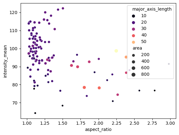
We can embed and visualize other features by providing a few extra arguments, for example we can use the area measurement to encode the size of the data points and the major axis length can be used to visualize data points in different colours from the magma color map.
sns.scatterplot(data=df,
            x = "aspect_ratio",
            y = "intensity_mean",
            size = "area",
            hue = "major_axis_length",
            palette = 'magma')
<AxesSubplot: xlabel='aspect_ratio', ylabel='intensity_mean'>
The scatterplot function is an axes-level function. This means, if we want to add subplots, we also need to create a figure and axes from matplotlib first and pass the axes handles.
Scatter plots with subplots#
Seaborn also has figure-level functions, where the subplots are an argument.
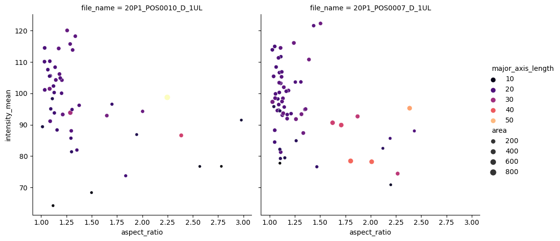
In the example below, we use the relplot function (from relationship) and separate the files by providing ‘file_name’ to the argument col. This allows us to see measurements seprated by the image file the measurements were taken from.
sns.relplot(data=df,
            x = "aspect_ratio",
            y = "intensity_mean",
            size = "area",
            hue = "major_axis_length",
            col = "file_name",
            palette = 'magma')
<seaborn.axisgrid.FacetGrid at 0x148dd2d2be0>