Clustering with UMAPs#
Clustering objects can be challenging when working with many parameters, in particular when interacting with data manually. To reduce the number of parameters, dimensionality reduction techniques such as the Uniform Manifold Approximation Projection (UMAP) have been developed. In this notebook we use the technique to differentiate nuclei in an image which are mitotic from those which are not mitotic.
See also
from skimage.data import human_mitosis
from napari_segment_blobs_and_things_with_membranes import voronoi_otsu_labeling
from napari_simpleitk_image_processing import label_statistics
from sklearn.preprocessing import StandardScaler
import numpy as np
import umap
import seaborn
import pyclesperanto_prototype as cle
import matplotlib.pyplot as plt
Example data#
First, we load the example image (taken from the scikit-image examples) showing human cell nuclei.
image = cle.asarray(human_mitosis())
image

|
cle._ image

|
labels = cle.voronoi_otsu_labeling(image, spot_sigma=2.5, outline_sigma=0)
labels

|
cle._ image
|
Feature extraction#
We then measure properties of the nuclei such as intensity, size, shape, perimeter and moments.
nuclei_statistics = label_statistics(image, labels,
                                     intensity=True,
                                     size=True,
                                     shape=True,
                                     perimeter=True,
                                     moments=True)
nuclei_statistics.head(15)
| label | maximum | mean | median | minimum | sigma | sum | variance | elongation | feret_diameter | ... | number_of_pixels_on_border | perimeter | perimeter_on_border | perimeter_on_border_ratio | principal_axes0 | principal_axes1 | principal_axes2 | principal_axes3 | principal_moments0 | principal_moments1 | |
|---|---|---|---|---|---|---|---|---|---|---|---|---|---|---|---|---|---|---|---|---|---|
| 0 | 1 | 83.0 | 69.886364 | 73.359375 | 48.0 | 9.890601 | 3075.0 | 97.823996 | 1.858735 | 9.486833 | ... | 10 | 25.664982 | 10.0 | 0.389636 | 0.998995 | -0.044825 | 0.044825 | 0.998995 | 1.926448 | 6.655680 |
| 1 | 2 | 46.0 | 42.125000 | 43.328125 | 38.0 | 2.748376 | 337.0 | 7.553571 | 0.000000 | 7.000000 | ... | 8 | 15.954349 | 8.0 | 0.501431 | 1.000000 | 0.000000 | 0.000000 | 1.000000 | 0.000000 | 5.250000 |
| 2 | 3 | 53.0 | 44.916667 | 45.265625 | 38.0 | 4.461111 | 539.0 | 19.901515 | 3.609511 | 6.000000 | ... | 7 | 14.843629 | 7.0 | 0.471583 | 1.000000 | 0.000000 | 0.000000 | 1.000000 | 0.243056 | 3.166667 |
| 3 | 4 | 92.0 | 65.603175 | 65.609375 | 38.0 | 14.475273 | 4133.0 | 209.533538 | 1.212933 | 10.000000 | ... | 7 | 29.687257 | 7.0 | 0.235791 | 0.914511 | 0.404561 | -0.404561 | 0.914511 | 4.227271 | 6.219189 |
| 4 | 5 | 59.0 | 46.315068 | 46.234375 | 38.0 | 5.065890 | 3381.0 | 25.663242 | 1.249507 | 11.401754 | ... | 9 | 34.264893 | 9.0 | 0.262660 | 0.363116 | -0.931744 | 0.931744 | 0.363116 | 5.001247 | 7.808286 |
| 5 | 6 | 75.0 | 54.087838 | 53.984375 | 38.0 | 8.394952 | 8005.0 | 70.475225 | 1.280946 | 14.866069 | ... | 6 | 42.864805 | 6.0 | 0.139975 | 0.183365 | -0.983045 | 0.983045 | 0.183365 | 9.187499 | 15.075056 |
| 6 | 7 | 96.0 | 61.033333 | 62.703125 | 38.0 | 15.166831 | 3662.0 | 230.032768 | 3.402583 | 15.132746 | ... | 0 | 36.716372 | 0.0 | 0.000000 | -0.014158 | -0.999900 | 0.999900 | -0.014158 | 1.446932 | 16.751957 |
| 7 | 8 | 100.0 | 70.000000 | 74.328125 | 39.0 | 16.138291 | 4480.0 | 260.444444 | 1.022473 | 9.219544 | ... | 0 | 29.917295 | 0.0 | 0.000000 | 0.917896 | -0.396820 | 0.396820 | 0.917896 | 5.073067 | 5.303642 |
| 8 | 9 | 65.0 | 53.117647 | 53.015625 | 38.0 | 6.358751 | 3612.0 | 40.433714 | 1.299197 | 9.848858 | ... | 0 | 29.687257 | 0.0 | 0.000000 | 0.108143 | -0.994135 | 0.994135 | 0.108143 | 4.175749 | 7.048300 |
| 9 | 10 | 79.0 | 59.594937 | 60.765625 | 38.0 | 9.191020 | 4708.0 | 84.474846 | 1.412593 | 11.661904 | ... | 0 | 36.946410 | 0.0 | 0.000000 | 0.957268 | 0.289203 | -0.289203 | 0.957268 | 4.709643 | 9.397712 |
| 10 | 11 | 80.0 | 59.333333 | 58.828125 | 38.0 | 10.281620 | 4450.0 | 105.711712 | 1.136874 | 10.000000 | ... | 0 | 30.472655 | 0.0 | 0.000000 | 0.494998 | -0.868894 | 0.868894 | 0.494998 | 5.244425 | 6.778330 |
| 11 | 12 | 96.0 | 69.666667 | 71.421875 | 39.0 | 14.848699 | 4389.0 | 220.483871 | 1.177721 | 9.486833 | ... | 0 | 28.021176 | 0.0 | 0.000000 | -0.266249 | -0.963904 | 0.963904 | -0.266249 | 4.246311 | 5.889743 |
| 12 | 13 | 102.0 | 78.533333 | 82.078125 | 42.0 | 16.168994 | 3534.0 | 261.436364 | 2.122467 | 11.000000 | ... | 12 | 27.791138 | 12.0 | 0.431792 | -0.020958 | -0.999780 | 0.999780 | -0.020958 | 1.781948 | 8.027435 |
| 13 | 14 | 72.0 | 53.914286 | 53.984375 | 38.0 | 6.819867 | 7548.0 | 46.510586 | 1.226967 | 14.317821 | ... | 0 | 42.864805 | 0.0 | 0.000000 | 0.972168 | -0.234285 | 0.234285 | 0.972168 | 9.112690 | 13.718688 |
| 14 | 15 | 99.0 | 72.049180 | 73.359375 | 38.0 | 17.157531 | 4395.0 | 294.380874 | 1.298605 | 9.433981 | ... | 0 | 28.021176 | 0.0 | 0.000000 | 0.562829 | -0.826574 | 0.826574 | 0.562829 | 3.746099 | 6.317325 |
15 rows × 27 columns
# list all columns we measured
nuclei_statistics.keys()
Index(['label', 'maximum', 'mean', 'median', 'minimum', 'sigma', 'sum',
       'variance', 'elongation', 'feret_diameter', 'flatness', 'roundness',
       'equivalent_ellipsoid_diameter_0', 'equivalent_ellipsoid_diameter_1',
       'equivalent_spherical_perimeter', 'equivalent_spherical_radius',
       'number_of_pixels', 'number_of_pixels_on_border', 'perimeter',
       'perimeter_on_border', 'perimeter_on_border_ratio', 'principal_axes0',
       'principal_axes1', 'principal_axes2', 'principal_axes3',
       'principal_moments0', 'principal_moments1'],
      dtype='object')
Feature selection#
In the image it is obvious that dividing nuclei are brighter than others. Furthermore, they apper elongated. Thus, we select intensity and shape-based features.
selected_table = nuclei_statistics[
    [
        "mean",
        "variance",
        "elongation",
    ]
]

selected_statistics = selected_table.values
Standard scaling#
We then scale those measurements so that intensity levels and distances can be interpreted in a balanced way (Read more).
scaled_statistics = StandardScaler().fit_transform(selected_statistics)

type(scaled_statistics), scaled_statistics.shape
(numpy.ndarray, (320, 3))
Plotting#
For demonstration purposes, we plot the three selected features against each other.
def hide_current_axis(*args, **kwds):
    plt.gca().set_visible(False)

g = seaborn.PairGrid(selected_table)
g.map(seaborn.scatterplot)
<seaborn.axisgrid.PairGrid at 0x22894d7e890>
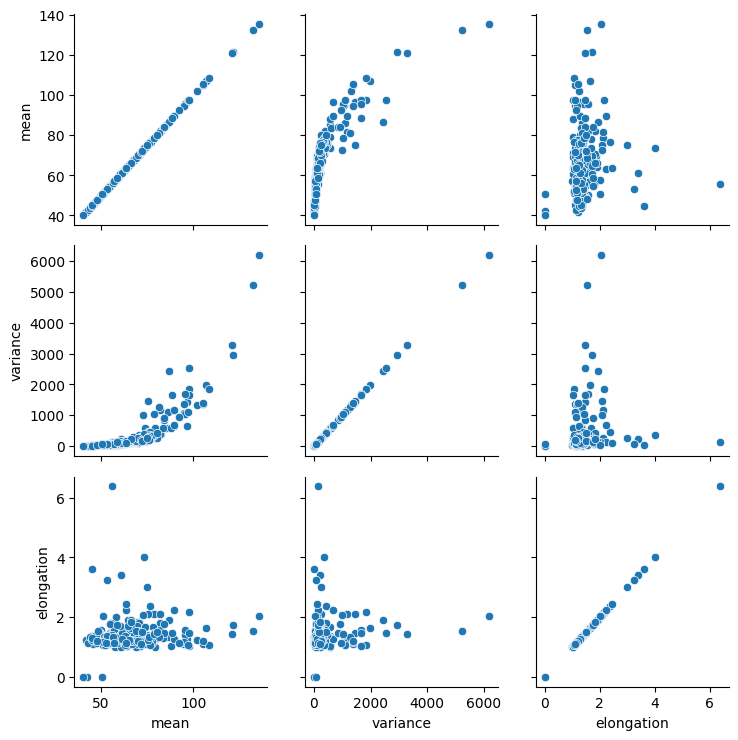
From these plots, one could presume that datapoints with high mean intensity, variance and/or elongation are mitotic. However, there is no clear group of data points that are characteristically different from others, which could be easily differentiated.
Dimensionality reduction#
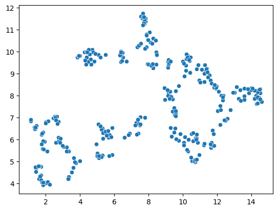
To demonstrate the UMAP algorithm, we now reduce these three dimensions to two.
reducer = umap.UMAP()
embedding = reducer.fit_transform(scaled_statistics)
type(embedding), embedding.shape
(numpy.ndarray, (320, 2))
seaborn.scatterplot(x=embedding[:, 0],
                    y=embedding[:, 1])
<Axes: >
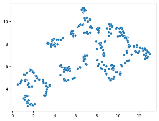
A note on repeatability#
The algorithm behind the UMAP is partially a non-deterministic. Thus, if you run the same code twice, the result might look slightly different.
reducer = umap.UMAP()
embedding2 = reducer.fit_transform(scaled_statistics)

seaborn.scatterplot(x=embedding2[:, 0],
                    y=embedding2[:, 1])
<Axes: >
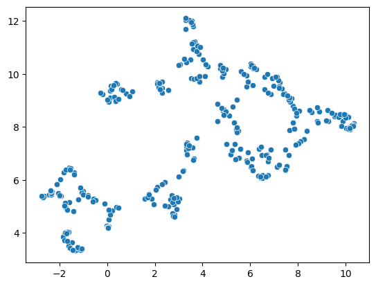
reducer = umap.UMAP()
embedding2 = reducer.fit_transform(scaled_statistics)

seaborn.scatterplot(x=embedding2[:, 0],
                    y=embedding2[:, 1])
<Axes: >
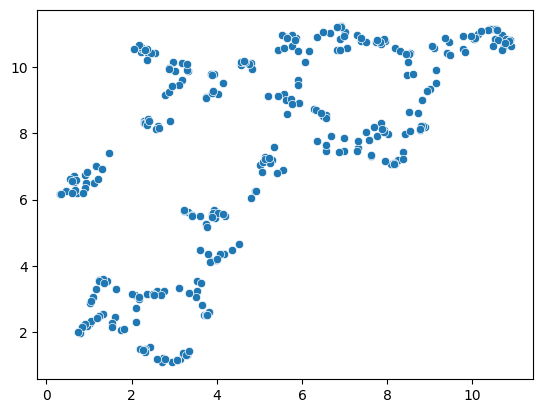
This limitation can be circumvented by providing a non-random seed random_state. However, it does not solve the general limitation. If our input data is slightly different, e.g. coming from a different image showing different cells, we may not receive the same UMAP result.
reducer = umap.UMAP(random_state=42)
embedding3 = reducer.fit_transform(scaled_statistics)

seaborn.scatterplot(x=embedding3[:, 0],
                    y=embedding3[:, 1])
C:\Users\rober\miniforge3\envs\bio11\Lib\site-packages\umap\umap_.py:1952: UserWarning: n_jobs value 1 overridden to 1 by setting random_state. Use no seed for parallelism.
  warn(
<Axes: >
reducer = umap.UMAP(random_state=42)
embedding4 = reducer.fit_transform(scaled_statistics)

seaborn.scatterplot(x=embedding4[:, 0],
                    y=embedding4[:, 1])
C:\Users\rober\miniforge3\envs\bio11\Lib\site-packages\umap\umap_.py:1952: UserWarning: n_jobs value 1 overridden to 1 by setting random_state. Use no seed for parallelism.
  warn(
<Axes: >
nuclei_statistics["UMAP1"] = embedding4[:, 0]
nuclei_statistics["UMAP2"] = embedding4[:, 1]
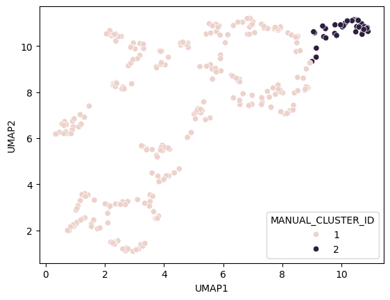
Manual clustering#
We can mark regions in the UMAP plot interactively (e.g. using the napari-clusters-plotter). To mimik this in a notebook, we set a manual threshold on a single UMAP axis to mark a region of data points we would like to investigate further. As mentioned above, as the UMAP result may not be 100% repeatable, we might need to adapt this threshold after generating a new UMAP on a different dataset.
def manual_threshold(x):
    if x < 9:
        return 1
    else:
        return 2

nuclei_statistics["MANUAL_CLUSTER_ID"] = [
    manual_threshold(x)
    for x in nuclei_statistics["UMAP1"]
]
seaborn.scatterplot(
    x=nuclei_statistics["UMAP1"],
    y=nuclei_statistics["UMAP2"],
    hue=nuclei_statistics["MANUAL_CLUSTER_ID"],
)
<Axes: xlabel='UMAP1', ylabel='UMAP2'>
Cluster visualization in image space#
# put a 0 for background in front
new_values = [0] + nuclei_statistics["MANUAL_CLUSTER_ID"].tolist()

print(new_values[:10])
[0, 1, 1, 1, 1, 1, 1, 1, 1, 1]
cluster_id_image = cle.replace_intensities(labels, new_values)
cle.imshow(cluster_id_image, labels=True)
C:\Users\rober\miniforge3\envs\bio11\Lib\site-packages\pyclesperanto_prototype\_tier9\_imshow.py:35: UserWarning: cle.imshow is deprecated, use stackview.imshow instead.
  warnings.warn("cle.imshow is deprecated, use stackview.imshow instead.")
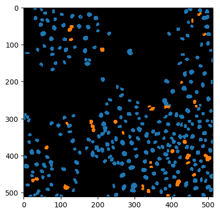
label_edges = cle.detect_label_edges(labels)
coloured_label_edges = label_edges * cluster_id_image
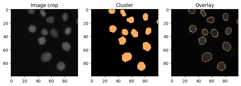
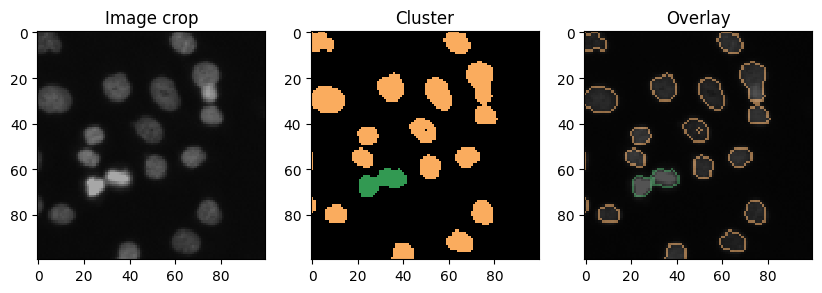
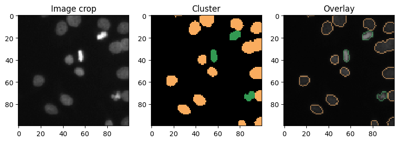
def show_crop(x=0, y=0, size=100):
fig, axs = plt.subplots(1,3, figsize=(10,10))
cle.imshow(image[x:x+size, y:y+size], plot=axs[0],
min_display_intensity=0,
max_display_intensity=255)
cle.imshow(cluster_id_image[x:x+size, y:y+size], labels=True, plot=axs[1],
min_display_intensity=0,
max_display_intensity=3)
cle.imshow(image[x:x+size, y:y+size], continue_drawing=True, plot=axs[2],
min_display_intensity=0,
max_display_intensity=255)
cle.imshow(coloured_label_edges[x:x+size, y:y+size], labels=True, alpha=0.5,
min_display_intensity=0,
max_display_intensity=3,
plot=axs[2])
axs[0].set_title("Image crop")
axs[1].set_title("Cluster")
axs[2].set_title("Overlay")
show_crop()
show_crop(400, 0)
show_crop(0, 400)