Visualizing relationships between feature spaces#
When analyzing feature measurements and dimensionality reduction results, e.g. involving a UMAP, one often switches between those spaces. In this notebook we demonstrate how one can interpolated between these spaces.
import pandas as pd
import seaborn as sns
First, we load a pandas dataframe of a .csv file containing some measurements, two UMAP columns and a manual selection of some data points.
df = pd.read_csv('../../data/blobs_statistics_with_umap.csv')

df.head()
| Unnamed: 0 | area | mean_intensity | minor_axis_length | major_axis_length | eccentricity | extent | feret_diameter_max | equivalent_diameter_area | bbox-0 | bbox-1 | bbox-2 | bbox-3 | UMAP1 | UMAP2 | selection | |
|---|---|---|---|---|---|---|---|---|---|---|---|---|---|---|---|---|
| 0 | 0 | 422 | 192.379147 | 16.488550 | 34.566789 | 0.878900 | 0.586111 | 35.227830 | 23.179885 | 0 | 11 | 30 | 35 | 7.685868 | 3.738014 | False |
| 1 | 1 | 182 | 180.131868 | 11.736074 | 20.802697 | 0.825665 | 0.787879 | 21.377558 | 15.222667 | 0 | 53 | 11 | 74 | 8.768059 | 7.172123 | True |
| 2 | 2 | 661 | 205.216339 | 28.409502 | 30.208433 | 0.339934 | 0.874339 | 32.756679 | 29.010538 | 0 | 95 | 28 | 122 | 6.129949 | 3.477662 | False |
| 3 | 3 | 437 | 216.585812 | 23.143996 | 24.606130 | 0.339576 | 0.826087 | 26.925824 | 23.588253 | 0 | 144 | 23 | 167 | 5.410176 | 4.095456 | False |
| 4 | 4 | 476 | 212.302521 | 19.852882 | 31.075106 | 0.769317 | 0.863884 | 31.384710 | 24.618327 | 0 | 237 | 29 | 256 | 5.280250 | 3.861278 | False |
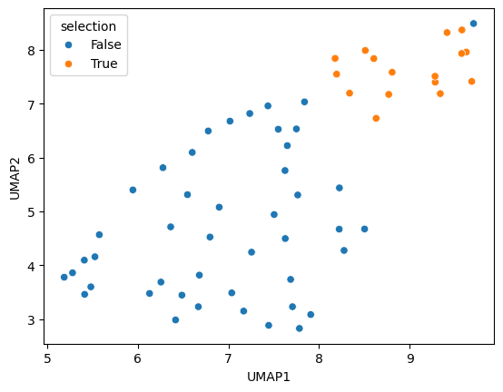
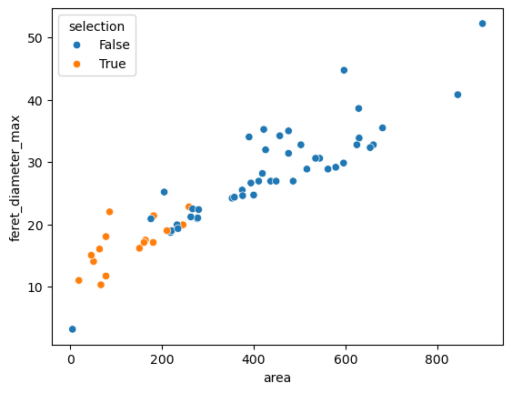
We then visualize the two UMAP columns and two other columns of features of interest.
sns.scatterplot(data=df, x='UMAP1', y='UMAP2', hue='selection')
<Axes: xlabel='UMAP1', ylabel='UMAP2'>
sns.scatterplot(data=df, x='area', y='feret_diameter_max', hue='selection')
<Axes: xlabel='area', ylabel='feret_diameter_max'>
Interpolating between feature spaces#
Drawing an animation of plots that are interpolated between the two plots above can be done using Python. As the procedure is a bit complicated, we asked a language model to write this code for us. Manual adaption of the code was done to make the video play back-and-forth and to modify frame delay. Hence, only the last code line was written by a human.
from bia_bob import bob
bob.initialize(model="gpt-4o-2024-08-06", vision_model="gpt-4o-2024-08-06")
import numpy as np
from sklearn.preprocessing import MinMaxScaler
from io import BytesIO
from skimage.io import imread
import matplotlib.pyplot as plt
import stackview

# Normalize dataframe columns to range between 0 and 1
scaler = MinMaxScaler()
df_normalized = df.copy()
df_normalized[df_normalized.columns] = scaler.fit_transform(df_normalized[df_normalized.columns])

# Create initial plots
fig, ax = plt.subplots(figsize=(8, 6))

# Storage for images
plot_images = []

# Interpolate and generate plots
for i in np.linspace(0, 1, 12): # 12 steps including 0 and 1
    ax.clear()
    x_col = (1 - i) * df_normalized['area'] + i * df_normalized['UMAP1']
    y_col = (1 - i) * df_normalized['feret_diameter_max'] + i * df_normalized['UMAP2']

    sns.scatterplot(x=x_col, y=y_col, hue=df['selection'], ax=ax)
    ax.set_title(f"Interpolation {i:.1f}")

    buf = BytesIO()
    plt.savefig(buf, format='png')
    buf.seek(0)
    plot_image = imread(buf)
    plot_images.append(plot_image)

plt.close(fig)

# Use Stackview to animate the sequence of plots
stackview.animate(np.stack(plot_images + plot_images[::-1]))
c:\structure\code\stackview\stackview\_animate.py:64: UserWarning: The image is quite large (> 10 MByte) and might not be properly shown in the notebook when rendered over the internet. Consider subsampling or cropping the image for visualization purposes.
  warnings.warn("The image is quite large (> 10 MByte) and might not be properly shown in the notebook when rendered over the internet. Consider subsampling or cropping the image for visualization purposes.")
